This was a fun little voluntary project organized by Danield Huffman from somethingaboutmaps.com to produce a series of project cards.I thought it would be a nice opportunity to share some of my working notes to see if my process makes sense and just to put it out there for others to use.
Inspiration
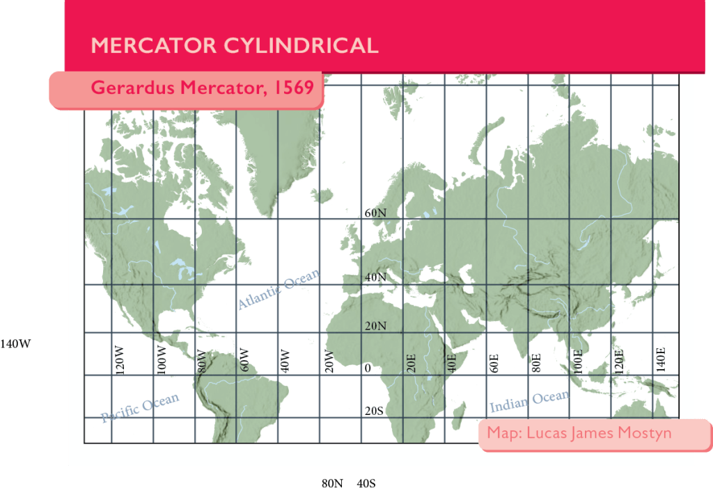
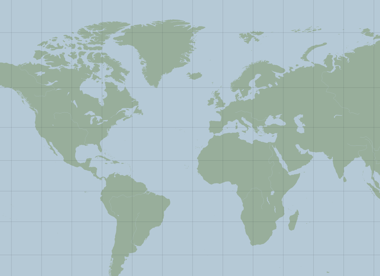
First of all, here is some inspiration. This is an example from another participant that I like a lot.
Print Formatting
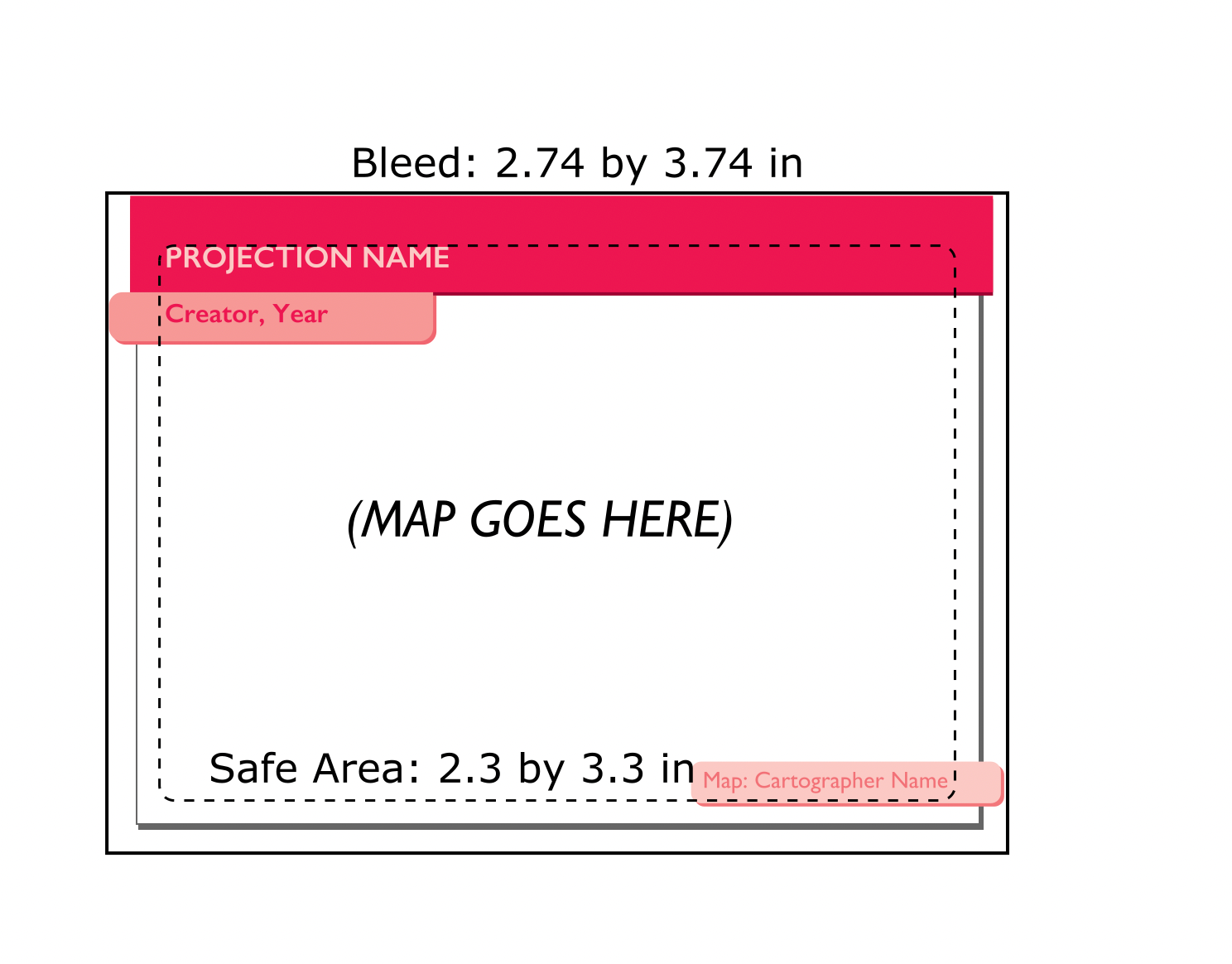
The template was provided, which was nice. 2.3 inc = 5.8cm x 3.3 = 8.3cm. I always try to start with the output format in mind because it’s too easy to get carried away with crazy amounts of data and totally forget it will be invisible.
Originally I tried to do this in InkScape but quickly gave up and installed illustrator, sorry open source community 😦
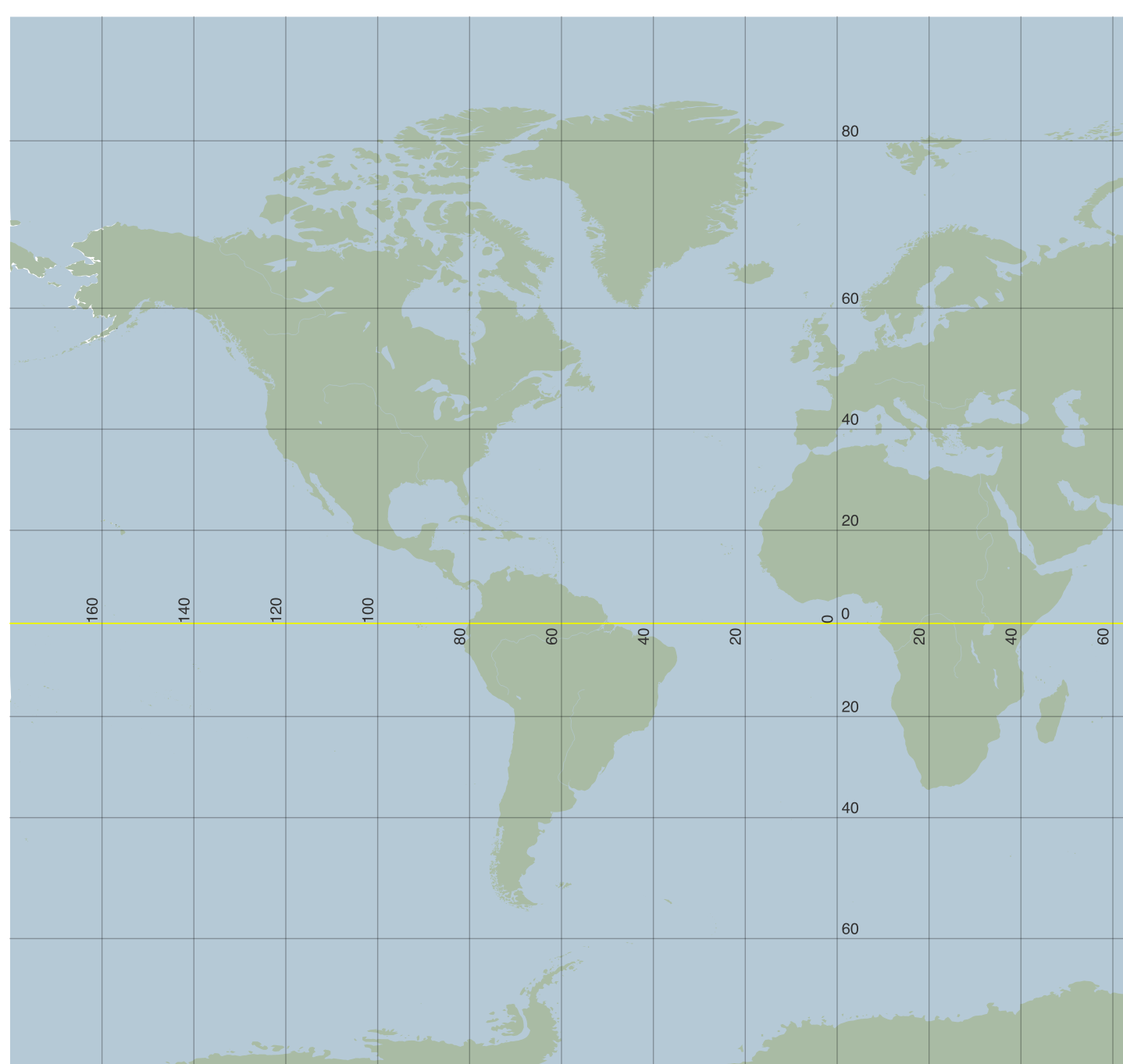
QGIS data export at the right scale
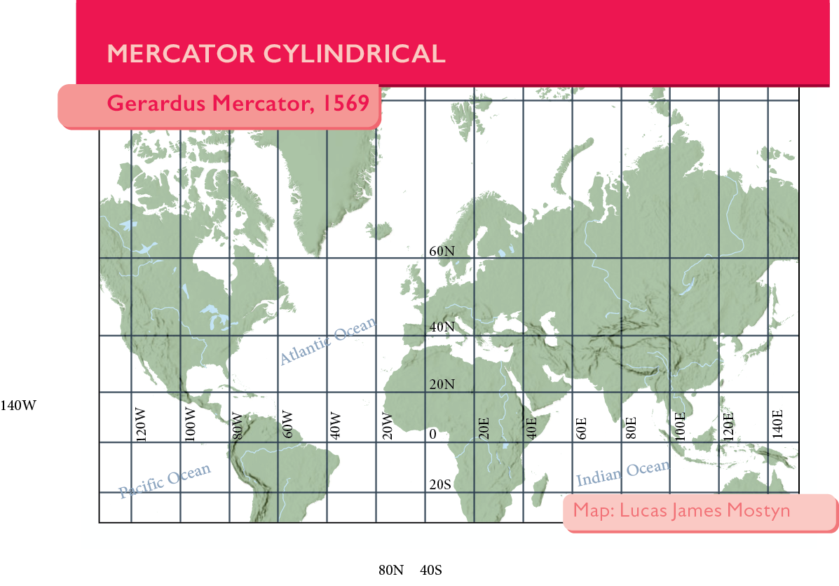
I’m using a QGIS program for the export because I want to get the graticles correct and done with a full GIS program. To do this I’ve downloaded all of the data I want to show from Natural Earth, including the graticule lines.
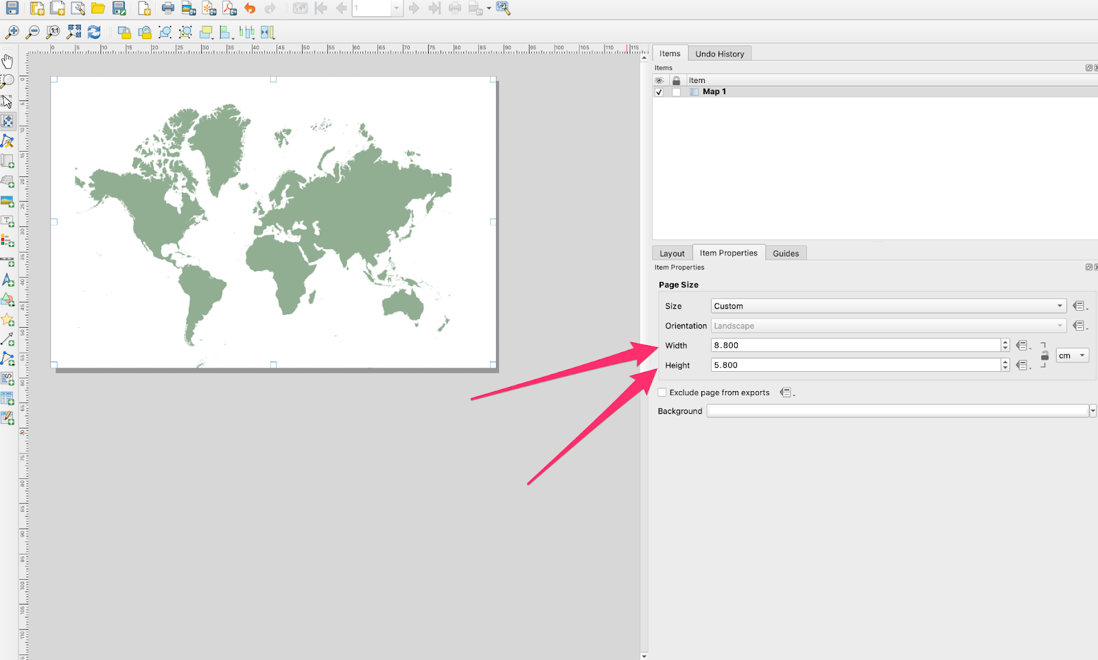
For the export I’ve used the layout function of QGIS and set the export to use the same ratio as the output card.
Contents of the map in QGIS
It’s a very small map and honestly, the map isn’t even the purpose of this exercise, we’re trying to show off the projection. That said, it’s pretty hard to understand a projection without reference information. With that in mind i’ve gone for a minimal amount of information
- Land masses
- Rivers and major lakes
- Oceans
- Hillshade
And then to highlight the projection the graticule lines to really visualize the distortion, however these lines are usually pretty thin. In this case we need to thicken them up for the printing. Daniel recommended a minimum value of 0.5pt (that’s 0.17mm or 0.0069 inches).
Working in Photoshop
The final piece that I’ll have to do in photoshop is to use a linear burn on a hillshade to accentuate the values on the land masses. So to begin moving this to another format I’m going to be exporting these as .tif files with an associated .wld file. With the linear burn applied we get this:
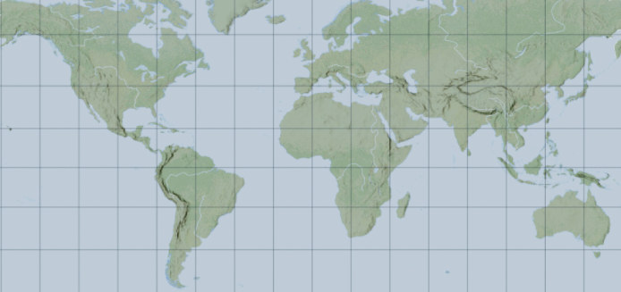
It’s a pretty cool effect. The only problem here was that I didn’t really want to have the graticule lines in photoshop but I couldn’t separate them into illustrator easily. I’m sure given more time I could work it out but it was getting a little frustrating so I just loaded it into photoshop in the end.
Illustrator
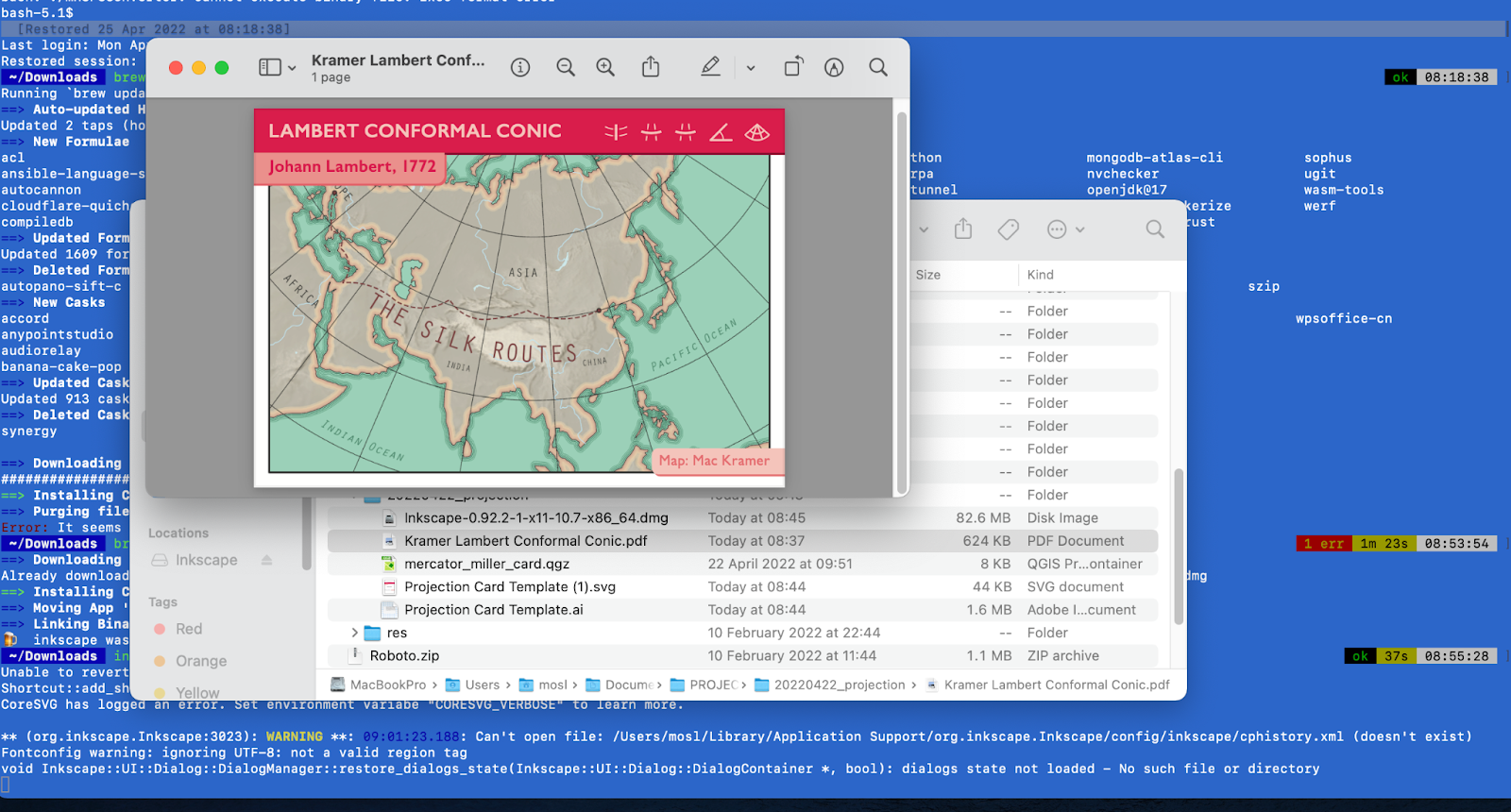
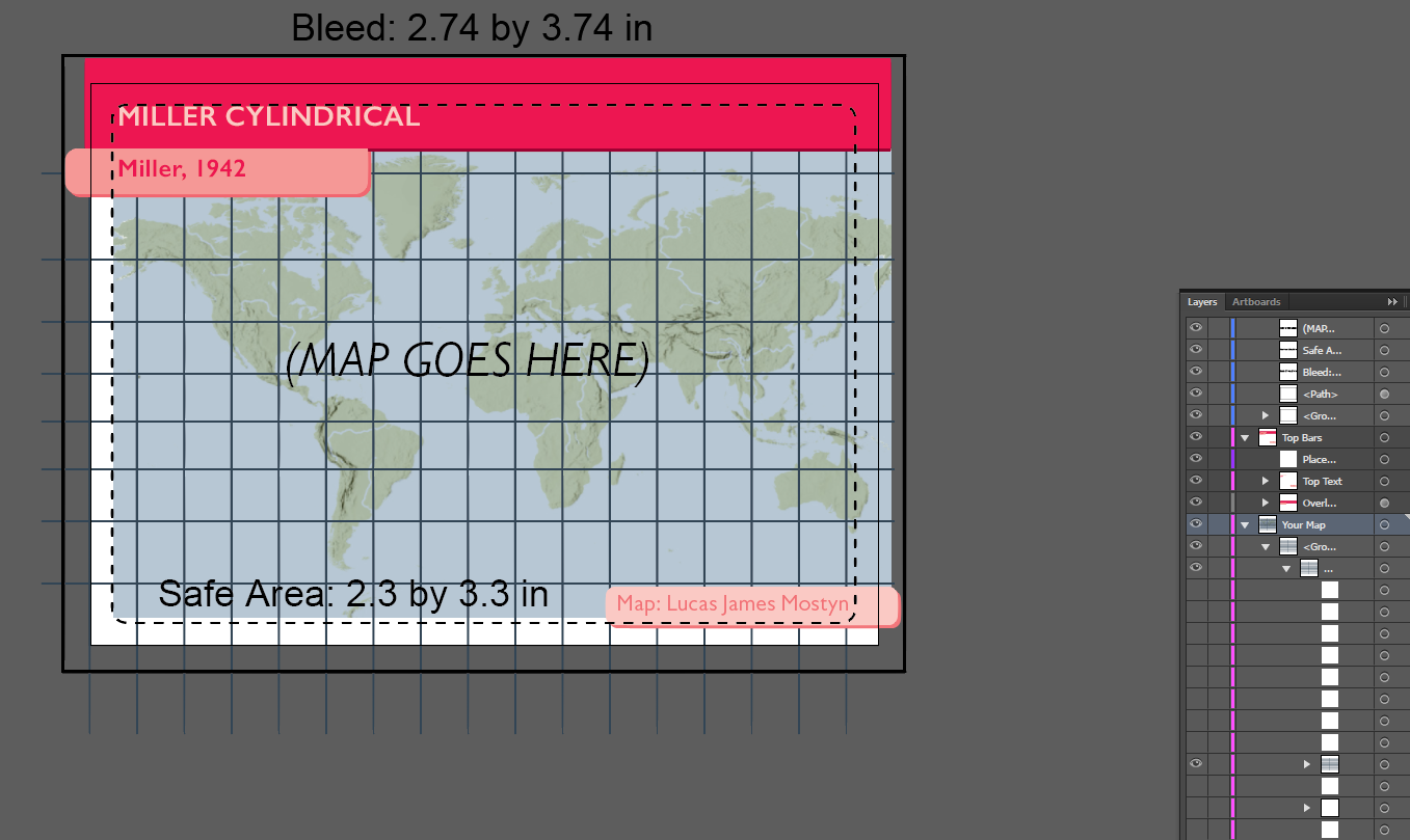
After creating the map in a combination of QGIS and Photoshop I exported the data as a tif and loaded that into the correct space in illustrator…. Only to realise that I’d measured badly in the original export from QGIS. See below image.
So after re-measuring, re exporting and re photoshopping I imported it once more to illustrator and it fit the ‘Safe Area’.
Labeling
I think the most difficult part of any map is the labeling, and so I tend towards less than more, just because it’s a difficult subject!
I decided to hand label 2 things only.
- Graticule
- Oceans
I did this is illustrator rather than QGIS
Here is the Miller card in which Daniel helped me a little by increasing font size, and fixing the halos. So it was lucky for me that I did the labels in illustrator rather than QGIS. If I had done that in QGIS then final edits would have been impossible.

Here I thought I’d experiment with no ocean data just to change things up a little.
Thanks for reading and thanks to Daniel for organising you can follow his updates at https://somethingaboutmaps.wordpress.com/2022/04/08/projection-cards/

Leave a comment