This is an introductory tutorial for making facility maps using GIS. I’ll be working with ArcGIS Pro, the recipe applies equally well for QGIS or ArcMap.
GIS projects are usually data driven. Projects progress to analysis and finally to either web or print map. That’s what GIS people like to do. We’re just not asked to do facility maps all that often. Graphic artists tend to get these contracts for two reasons:
- They focus on presenting great portfolios
- They make graphical changes quite easily
On the other hand though:
- Their work takes a long time
- They create data from scratch, using existing maps or google images
- The map is never updated, certainly not by a user

There is another way. GIS can be used quite effectively to make facility maps, maps that don’t cease to evolve once complete and can leverage existing data.
Step 1 – Design not data
GIS is data centric because of the analysis we perform. Graphic design is is not; make a mental shift. Your client probably has some idea of what they are looking for and that’s as good a starting point as any. If you’ve got no examples I like to scroll thing Pinterest or Tumblr for some inspiration. For this project my client brought in a stadium created in Adobe Illustrator. This is what they want, so to be successful I need to produce something very similar.
Step 2 – Deciding on the Data and the Containers
Start out with an idea of the data you’re going to need and the basic order. List out the major components to the map and group them into layers. I create group layers with general headings such as Base Vegetation and Transport.

Data Sources NZ
The more complex the map the more groups of data you will have. You want to source as much data as possible, this is what give us the edge over graphic designers, some great sources in New Zealand are:
Step 3 – Creating the Data
Unless you’re very lucky you’re probably going to need to create some data yourself. Aiming at pseudo realistic map I like to start with an aerial imagery base, partly because it gives context and partly because I genuinely enjoy looking at imagery.
Using the imagery I create the most prominent features first, in this case I started with the playing field, buildings and road. I then get everything to the right scale, there is no point working on minute detail for a display map if you’re not going to see it.

Once the major shapes are drawn I usually make print copy in gray scale, this helps me get an idea of where the eye is drawn.
Step 4 – Bringing in the detail
Once the scale and prominent features are in place it’s time to start filling in the details. Use the detail layers to frame your significant features:
- Pavements accentuate the roads
- Buildings highlight the paved areas
- Cricket club blocks highlight the playing field in this case

Choosing your Color
There are many online services for color selection, color brewer is one most people reading this should be familiar with. That said my personal preference is not to rely on color theory. I experiment using inkscape to query other maps color combinations. Typically I save great map examples to pinterest and use them for color choice, this gives me exposure to other work and great color ideas.
It’s still a good idea to keep the classic rules in mind though.
- Green for vegetation
- Reds for man made features
- Blues for water
Common sense Cartography but I’ve seen plenty of bad maps that didn’t heed these simple rules. If you’d like more on this I suggest checking out Ken Fields blog, as he’s pretty much the modern day expert here.
Another great source of for color selection is The Cartographic toolset
Step 5 – Share and review
It’s very difficult to get a map absolutely correct the firstly time around, especially given how much attention is paid to them by users. I tend to send screen shots at each phase of production, much like I might do an Agile type sprint.

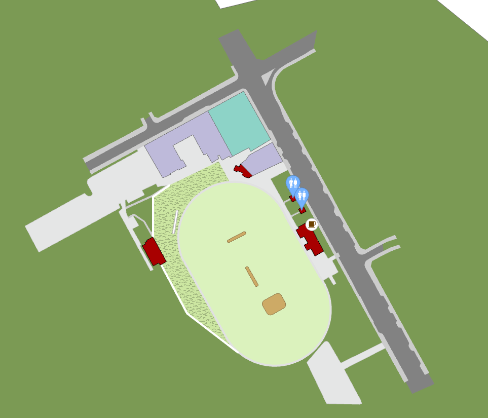
Finishing the map
And finally a facility map. Is it perfect, no. Was it quick, yes! This was produced in under 2 hours of total work time. I can publish it as a web map and have the facility owners make feature modifications themselves. 
For other examples of both facility graphics and print quality terrain maps, Geographx is a great source.
Thanks for taking the time to read. We all have our own trips and tricks for map production and I still have much to learn too. If you would like to contribute please use the comment blow below. I try to respond within 24 hours.

Leave a comment