We often find ourselves collecting and maintaining data. For GIS applications we use this data to answer questions about the world around us. Quite often the sheer quantity of data is overwhelming and the more we collect the harder it is to give a simple answer.
This project is going to use Hexagon bins for the Motutapu Restoration project data. If it’s successful I will be able to report on disparate data sources by binning it into a hexagon grid across the island. This will allow me to report temporally for the islands data records using one feature service, a hexagon grid.

Hexagon Grid Generation
I had a go at generating the hex grids in QGIS, ArcMap and ArcPro. I initially thought it was easier to generate the hex’s using QGIS but quickly found that managing them was a bit too cumbersome. ArcMap worked nicely once I imported the ESRI Generate Tessellation script; then when I had a go in ArcPro found it already had the script baked into the Toolbox search so i went with Pro.
The algorithm for generating the shapes is fascinating and I’d recommend having a little read of the docs if you’re interested. At a very high level it is something like this:
- Produce the points for the area of interest
- Generate lines around each point using some trig
- Make polygons from the lines
- Complete the exterior features (those without any constraining features)

I generated each hexagon at 1500m2 after trying a lot of different areas and found this to be a nice size for the scale of the final report map.

Why Hexagons
Hexagons are quite the in vogue thing these days with all of the election maps for the last couple of years showing the results using hex bins. I believe, that trend started with the UK elections which had some really nice illustrative hex maps in 2015.

The point of this project is to produce a nice cartographic reports and hexagons look nice.
Black Box Testing the Report
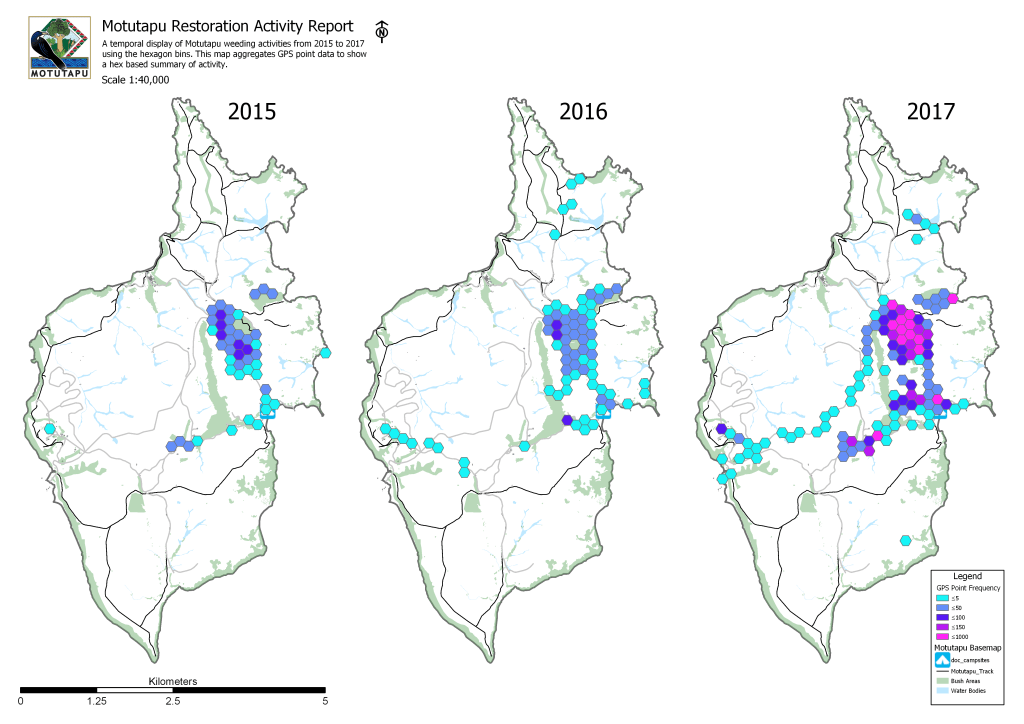
Here is a copy of the output I intent to produce programmatically. Before proceeding I’m sending this off as a pdf to the Restoration Trust to see how they respond. I’ve made up the data to make sure that I get the right look and feel of the end product.

After showing this to the volunteer team it was passed to the fundraising manager who wanted a totally different scale and purpose.

Rather than using this method to keep track of progress they wanted to highlight the effect that fund is having on the amount of progress being made on the island.
Scripting the Solution
I’ve generated a hexagon grid and I have time stamped GPS data for the years 2015, 2016 and 2017 of the volunteers who are working on the island. I’m going to process the data by counting the number of unique dates of tracking data which occur with each hexagon and incrementing the hexagons attributes.
Iterating over each hexagon and making updates
I started out with the idea that the best way to get this done would be with an update cursor, so I began by iterating over each hex. From there I was going to summarize the number of features within each hex. Below is the output iterating over each Hex and printing its unique grid code.

Following this link on geonet and this exchange on stackoverflow I found a faster workflow.
Spatial Join >> Summary Statistics >> Join Field
By making a spatial join using a one to many so you effectively duplicate your hex’s which contain multiple points. In the picture below you can see I’ve used tracking data to create a new set of Hexagons. What you can’t see is that there are 2000 hexagons, one for each point. I save this as a temporary layer.

I then use the summary statistics tool to get the frequence of each Hexagon in the temporary layer with the GRID_ID which I can use to join it back to the main Hexagon layer.

This is ideal, I’ve maintained all of my Hexagons on the final version, I can keep my yearly data in separate tables and its fast.

Once this process is complete I realized that I’d completed the brief without really needing to code anything. So I just repeated the procedure for all three years worth of data using the same three functions. Using the ArcPro ‘Geoprocessing History’ it was just a case of renaming a few files and I was done!
Presenting the Results
When I first symbolized the data I forgot to use the same data quantities for the color categories, which made it look as if there was almost as much work done in 2015 as 2017.

I generated a .lyr file from the 2017 data and imported the same symbology for the 2015 and 2016 data.

And finally I brought myself a little extra real estate by removing the borders around each map in the layout.

Thanks for reading, I hope you’ve enjoyed my hexagon maps!
Cheers,
Lucas

Leave a comment