Looking over the invoices for council I found $##redacted (large sum of money, larger than I was ultimately aloud to publish on the infographic or my blog ) being spent on illegal dumping every year. That is an impressive sum of money for a small city. So I’m producing a map to show the annual cost and distribution of illegal dumping in the City; while telling the story of how long it take the council to pick the trash up. The data has been collected using Survey123 and Workforce and visualized in ArcGIS pro.
Collection Time: In a Graphic
The take away stat from this map is that the city collects 84% of illegal dumping within 8 days. The final graphic uses the two bin bags, scaled to represent their values as a powerful visual way to show the %. It’s significantly more powerful than the pie chart option. Here you can see the different versions I tried out.


![]()
Collection Time: In a Map
The time it takes to collect illegal dumping is critical because the longer trash is left out, the more there is. If people see rubbish on the streets then they think its OK to put more there. So the longer it takes to clear the problem, the greater the problem becomes. Showing collection time spatially confirms that collection times are longer outside of the urban zones; represented here by larger circles. Some of the largest ones take over a 100 days to collect, subsequently creating a hotspot as more waste accumulates around the original trash.

Collection Time: As a Cluster Matrices
Cluster Matrices are an effective way of showing raw time series data in a somewhat visually compelling manner. While it is ancillary data, it gives people who like something more detailed something to dig into.


Collection Volume
This data is secondary to how long it takes to pick up, its included because there is a relationship between the two. As workload increases, pickup time also increases.
Collection Volume: Building a Better Graph
Using a pictograph I’m displaying the total number of request by month which is a little more explicit and reduces the need for a legend. Legends are great for scientific purposes but detract from a graphical representation such as this one.

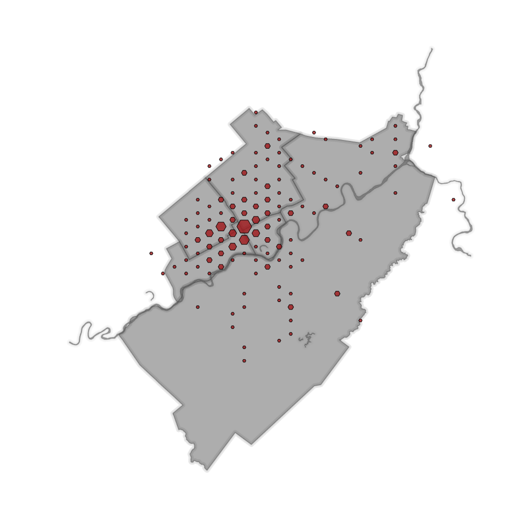
Collection Volume: A Hex Map
A Hex bin map to show the distribution of requests across the city. While the collection times are greater in the rural areas, the majority of offenses still occur within the city center and near suburbs.

The Final Product
The illegal dumping of trash costs the council $redacted. This map highlights the time it takes to collect the rubbish spatially, graphically as a picture and scientifically using the scipy plugins to ArcPro. The map focuses on collection time because it is the one component that council have direct control over. The faster we collect the trash, the less there is. The lower portion of the map details the distribution of total requests and the monthly breakdown of requests as a pictograph.

Please feel free to comment and share. The one adjustment I seriously considered and did not implement was using a purple color scheme for the distribution data and keeping the red for collection time data.
What are your thoughts?

Leave a reply to Kim Cancel reply