While working on a project I came across this effect. I was trying to render a height map, for both the country
and the local scale; in a grey as is typical for generating a relief shade. I’m using a 30m DEM.

While I was doing this I made a symbology mistake and stumbled across a fascinating new way to visualize, using discrete symbology (in ArcPro).
I give you, Rainbow Taraniki.

It looks terrible with distinct colors, but add a similar ramp and you can pull spatial relationships that I’ve never noticed before. Below you can see the clear elevated plains around Taraniki and the Ruapahu.

In Christchurch you can infer the rolling plains, river outlets and the dramatic hills that jut so dramatically.

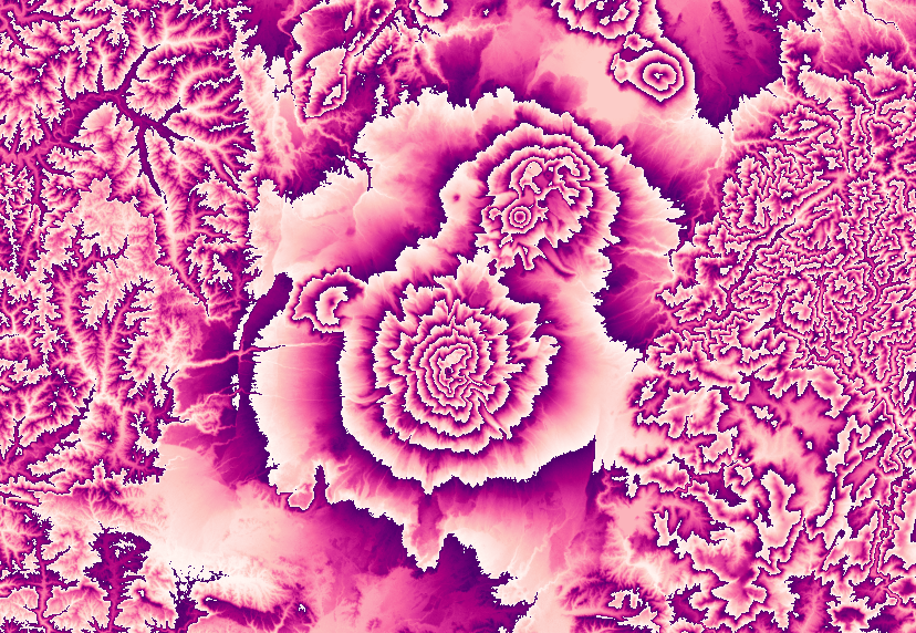
Here’s the Wellington region. Look carefully for the distinction between the valley and the sea, it’s deceptive. And my favorite, purple to pink around Ruapehu. It’s a weird effect and a different way to visualize height data.

Thanks for reading.

Leave a comment