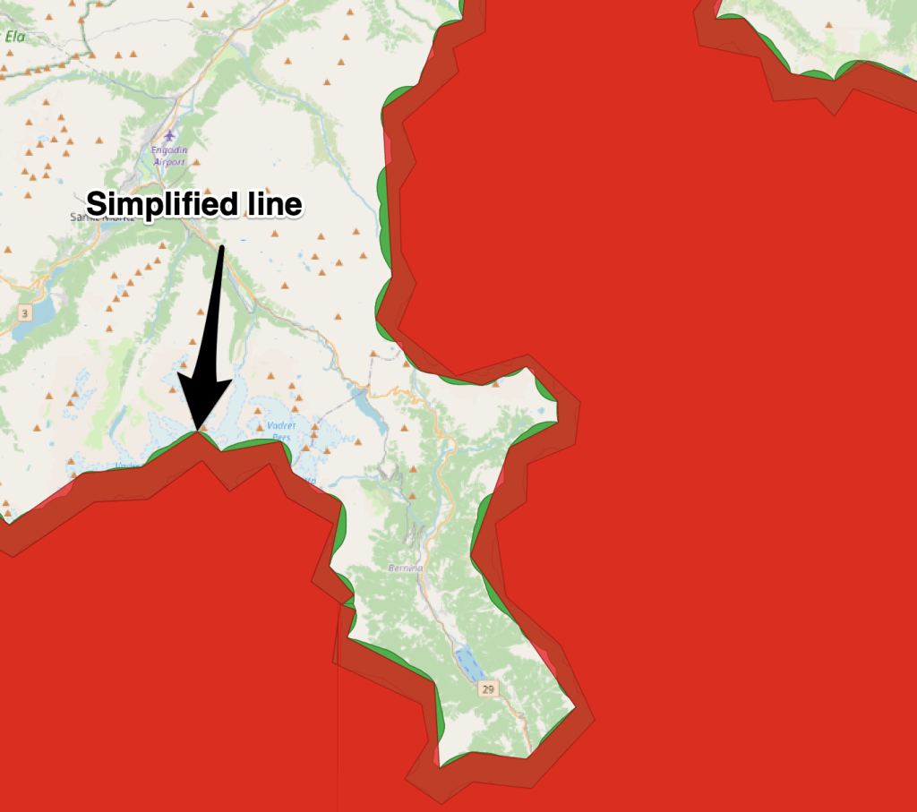
We have a highly detailed geojson file containing multipart polygons which represent the coverage of our data from the content program.This data needs to be fast to load but it is 320MB, all text. This is largely caused by each vertex in the polygon having a lot of xyz data. In cartographic applications we often run feature simplification to reduce the size of such data. Below in the blue line is what we have and the red line is what we want.
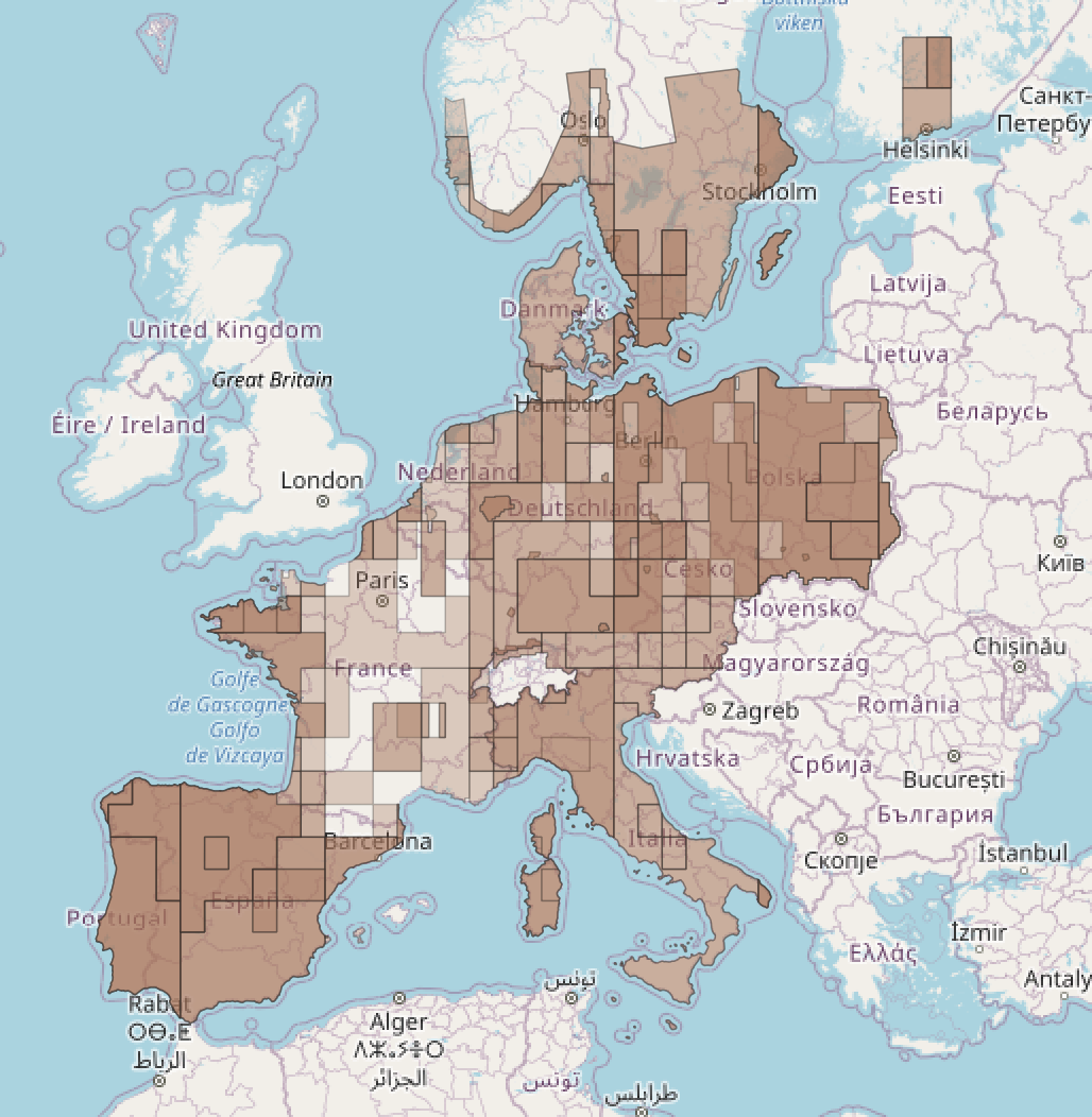
Here is what our original data looks like. I’ve added some transparency to the data so that you can see the density of data in certain areas.
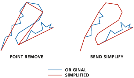
This data is heavy because of the sheer number of vertices in the lines. There are a few cartographic tools to help simplify this but we ultimately decided to use the Douglas-Peucker algorithm, named after the two Canadian Cartographers who came up with it.
Note: almost all GIS related stuff has some connection to Canada because Geospatial Computational processes first emerged there to manage the massive land areas.
The algorithm works recursively, halving the line while taking user input for the ideal level of detail. We have chosen to remove data within 900m.
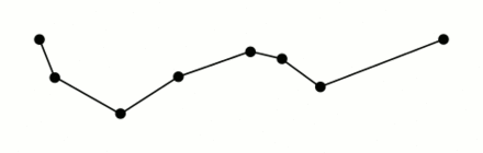
(I have stolen this awesome giff from wikipidea)
Here you can see our results. The red Polygon has been significantly reduced in size, from about 320 MB → 1.2 MB. While this might seem quite dramatic in the world of computer science I would say this is fairly normal in the Cartographic world. The reason begin that we are willingly and purposely removing information, whereas compression algorithms are most frequently looking to preserve information while storing it more effectively.

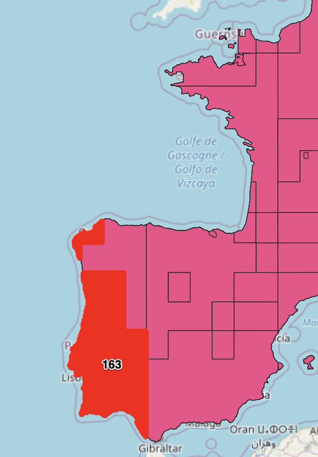
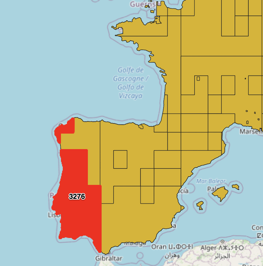
If we examine just one of the coverage datasets to illustrate this a little more. If we take one feature prior to the simplification we are at 3276 pt vertices in the polygons vs 163. We’ve lost a lot of information, but we’ve preserved the shape at this scale.
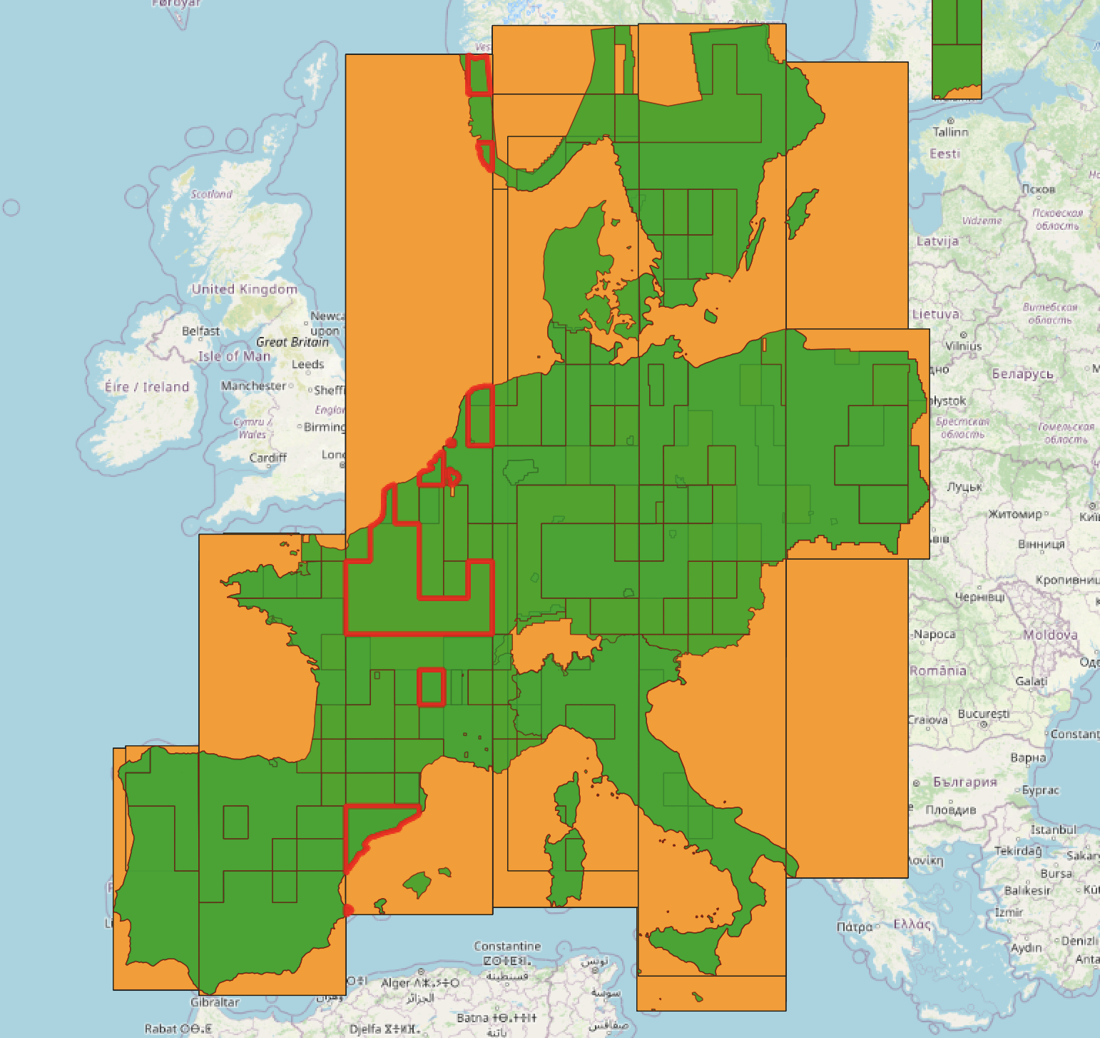
The final and I would say quite interesting thing to visualise here are the bounding boxes of the data. They looked a little strange at first but if you highlight the individual features you see each feature is actually a multipart polygon. This information [min_x, min_y, min_z, max_x, max_y, max_z] is used by the coverage to display.
I’ve written this all down in a blog because I suspect it will not come up again as a problem but it is so visual and interesting! And as we are the visual computing hub I thought it would be nice to see some of the visuals behind what we do!

Leave a comment