A cities public transport network relies on having sheltered dry places to wait for the next bus; especially in a student city. Damage to this infrastructure affects the whole service.

No one I spoke to about the problem seemed to know the full extent of the damage to bus shelters around the city. So I pulled the data from the RAMM, the road asset management system and asked around for volunteer to go and survey them.

We put together a simple Survey123 app and a couple of days later results came in. An ESRI feature service with a numeric field for the number of broken panes of glass and some photos. The first level of analysis is immediately achieved, scope of the problem. With panes of glass costing between $300 – $500 we have a total damage of approximately $38,000.00 as of the summer of 2018.

Without historical data on the problem we could not say that its dramatically trending, although we do know that significant damage has been done recently. So for the final map I have simply explained this in text. Without complex algorithms a small text cutin can have a strong impact so long as it is not too long. Since this infographic was made another $4000 worth of damage has been done to the same area.

We’ve been told before that data that is entirely spatial is sometimes hard for people to grasp, especially when dealing with city wide information. Here we use a block diagram to display one unit for each shelter. The first attempt:

People have said that they like the data to be pulled apart a little and clarified with color. In this format we can have a powerful graphic right in the title of the map.

Unlike a pie chart we see each data point and can manipulate the graphic to fit available space, making this the most flexible type of graphical display I can think of.

The main point to this map is that current policies are not sustainable and we have choices. I’ve researched the 3 available options and present them here. (We’re not including total price because it seems to fluctuate so dramatically between suppliers and depends upon the total number of shelters to repair.) I’ve positioned the current solution in the middle because the middle is typically the most forgettable in any event. I am unapologetically trying to sway the decision makers towards either Acrylic or Reinforced Glass.

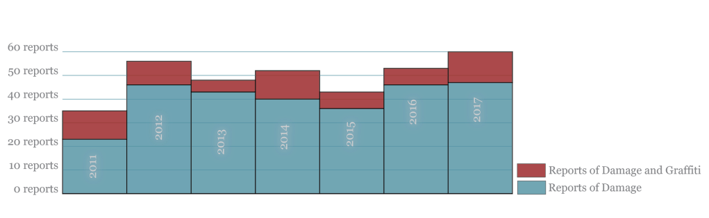
We do not have historical data on bus shelter damage, however finding data on call history to the council is possible. So I’ve written a script to find terms that refer to the damage of bus shelters and report number of phone calls. You can see below that I have been able to tell the story of an increase in reporting, with a peak of 60 reports in 2017. I’ve also displayed additional graffiti type data because chemicals sometimes eat into Acrylic and is thus relevant to the decision at hand.

Here’s the final map. Thanks for all the help everyone. Now it’s time to convince people to change some policies.


Leave a comment